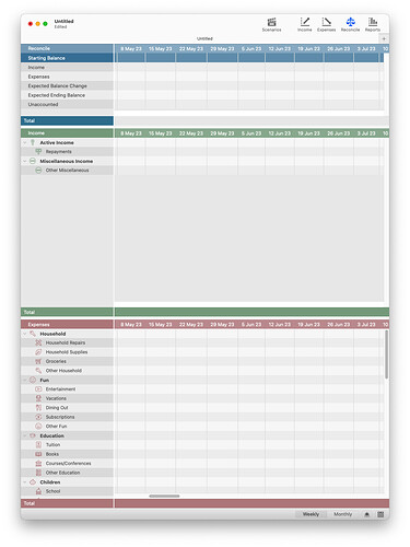
The Reconcile view has three sections:
- Reconcile
- Income
- Expenses
The application appears to automatically divide the vertical space equally across the last two sections (i.e. Income and Expenses). If either of these sections has significantly fewer lines (i.e. Categories) than the other, this results in wasted space in the corresponding section, while the other section ends up requiring vertical scrolling to bring desired lines into view.
If the vertical space allocated to each section could be adjusted manually (e.g. by dragging the thin empty dividing lines separating the sections), the user could configure a more effective workspace. Alternatively, the application could automatically reduce the height of a section having fewer lines to avoid the wasted space (the way the Reconcile section has a fixed height that accommodates the 5 lines that it has).
